Typography - Task 3: Type Design and Communication
Shema Goldie Angwen / 0372129
Typography Bachelor of Design (Hons) in
Creative Media / Taylor's University
Task 3: Type Design and Communication
INSTRUCTION
We were instructed to complete our Task 3 e-portfolio by next week and watch Mr. Vinod pre-recorded tutorial about FontLab.
Specific Feedback
- (I had already finished digitalizing my work the previous week)
Download FontLab 7 as soon as you finish the task.
Specific Feedback
Task 3: Type Design and Communication
TABLE OF CONTENTS
LECTURES
Lecture have been completed in Task 1 & Task 2.
TASK
Research (Week 7)
To start, I did some research and found these references from
R-Typography. I love the sharp serifs and the slight contrasts in stroke
thickness.
Sketches (Week 7)
After doing some research, I began doing sketches to explore different
writing styles for my type design. On a graph paper, I created sketches
with 3 different markers, each marker exploring 3 different writing
styles. Finally, I decided to go with the top-right corner type
style.
Then I wrote 'oledsnchtig,.#' using the writing style that I
chose.
Figure 1.3: Sketch
Deconstructing (Week 8)
Next, we were instructed to choose a suitable typeface from the 10
typefaces provided to deconstruct the letters "Hogb" in Illustrator. This
process helped me understand the nuances and details of how letterforms
are constructed. From the 10 typefaces, I chose ITC New Baskerville
because it matched my design best.
Figure 1.4: Deconstructing Letter 'H'
H:
- The top line is not completely straight, it actually has two slightly angled lines that meet at a point in the middle.
- The letter is symmetrical (both sides of the "H" look the same)
Figure 1.5: Deconstructing Letter 'o'
o:
- The "o" is not a perfect circle. It's more flattened or oval, where the width is bigger than the height.
Figure 1.6: Deconstructing Letter 'g'
g:
- The top part of the "g" (the upper bowl) is similar to the "o" but more flattened.
- The bottom loop of the "g" is wider than the top part.
- Loop of "g" does not close.
- Has an ear, which is a small stroke extending from the upper-right side of the bowl a lowercase g.
Figure 1.7: Deconstructing Letter 'b'
b:
- It has angled serif at both the top and bottom of the vertical stem.
Digitization (Week 9-10)
In the pre-recorded tutorial video (Typo Task 3A Typeface Construction (Shapes), Mr. Vinod demonstrates how to construct a typeface using Adobe
Illustrator.
I created a new artboard (1000 pt by 1000 pt). Draw a square (500
pt by 500 pt) to form the x-height. Then, I typed a few letters
'Tyd' and use guides to mark the x-height, ascender line, cap line,
descender line, and baseline. These guides will define the basic
structure of the letterforms. Once set up, I deleted everything
except for the guide lines. Then, I started constructing the
letterforms using shapes in Illustrator, following the guide lines
to ensure my letters are proportional and consistent.
The figure below shows the stacked-shapes I used to construct my
typeface.
Figure 1.8: Constructing from Shape
Then, I used the Pathfinder Unite function and the Curvature Tool
to transform the stacked-shapes into my typeface.
After showing the result to Ms.VItiyaa, I received some feedbacks
from her and decided to make revision. Here are the changes I made
from the first design to the final design:
- I created the letter 'e' from the letter 'o'.
- I created the letter 'd' by combining the letter 'c' (which then I flipped horizontally) with the letter 'l'.
- I created the letter 'h' from the letter 'n'
- I created the letter 'i' from the the letter 'l', and I copied the dot from period.
- I created another version of the letter 'g', and both Ms.Vitiyaa and I agreed that the new version was better.
- I made the letter 's' less sharp.
Here is the revised version:
Figure 1.11: The Measurement
Making Extra Alphabets (Week 11)
Then, I tried to create other letters besides 'oledsnchtig,.!#'.
Ms. Vitiyaa gave feedback when I created additional letters besides
those in “oledsnchtig,.!#”.
She suggested:
- Using the letter 'c' to design the ascender for the letter 'a'.
- Using the letter 'n' as a base to create the letter 'r'.
- Flipping the letter 'd' that I had created earlier to make the letter 'p'.
- Flipping the letter 'n' for the letter 'u'.
- She didn't like the 'f' and 'y'.
She explained that the letters in “oledsnchtig” contain base forms
for constructing other alphabets. She also encouraged me to
experiment creating the letters 'q' and 'w'.
After receiving feedback, I then decided to revise those letters and
also try to creating the rest of the alphabet since my friend asked
Ms.Vitiyaa if it was allowed to create other letters and she confirmed
that it was.
The revised version:
Figure 1.13: The Revised Version
Fontlab Progression (Week 11)
Figure 1.14: Readjusting Guidelines
Next, Ms.Vitiyaa instructed us to proceed to FontLab as soon as we
completed the task. I opened FontLab and then readjusted the
guidelines by selecting 'File > Font Info'.
Figure 1.14: Readjusting Guidelines
Then, I copied each letter from Adobe Illustrator and pasted it
into FontLab.
Figure 1.15: Pasting Letter into FontLab
Once I added all the characters, I selected 'Window > New Metric
Tab' and adjusted the spacing for each character. I did most of the
kerning for the letter 'j' since it often appeared too far from the
adjacent letters.
Figure 1.16: Adjusting Spacing
I named the typeface 'Lyrican', comes from the word 'lyrical' which means expressing personal thoughts in a beautiful way. This typefaces represents my thoughts, expressed in a beautiful form.
Poster (Week 11-13)
Then, we were instructed to create a poster using the font we designed. I made two posters.
Figure 1.17: Poster #1 (jpeg)For the second poster, I stacked the word "visible" three times, increasing the opacity as it moved upward.
Figure 1.18: Poster #2 Process Here is how my second poster turned out:
Figure 1.19: Poster #2 (jpeg)
Final Submission
Press here to Download Font
Figure 1.20: Screen Grab of FontLab process
Figure 1.21: Final Type Construction in AI (jpeg)
I pressed 'Command + Y' to change the view of the artboards to a black-and-white screen, showing only the outline. This helped me a lot in identifying problems and inconsistencies.
Figure 1.22: Final Type Construction in AI - Outline (jpeg)
Figure 1.23: Final Type Construction in AI (pdf)
FEEDBACK
WEEK 7
General Feedback
For Task 3, you need to research and then sketch the letters "HOGB" and "hogb" in both uppercase and lowercase using three different markers on graph paper, exploring with three different writing styles for each marker. Afterward, choose one of the 10 provided typefaces and dissect it in Adobe Illustrator.
Specific Feedback
-
WEEK 8
Independent Learning Week
WEEK 9
General Feedback
Ms. Vitiyaa reminded us to continue digitizing our work.
-
WEEK 8
Independent Learning Week
WEEK 9
General Feedback
Ms. Vitiyaa reminded us to continue digitizing our work.
Specific Feedback
Nice work, but some things should be revised. I made the revision immediately in class, and she told me that it was much better. I created two versions of the letter “g”, and we both agreed that the new version was better as it carried a character.
Nice work, but some things should be revised. I made the revision immediately in class, and she told me that it was much better. I created two versions of the letter “g”, and we both agreed that the new version was better as it carried a character.
WEEK 10
General FeedbackWe were instructed to complete our Task 3 e-portfolio by next week and watch Mr. Vinod pre-recorded tutorial about FontLab.
Specific Feedback
- (I had already finished digitalizing my work the previous week)
WEEK 11
General FeedbackDownload FontLab 7 as soon as you finish the task.
Specific Feedback
Ms. Vitiyaa gave feedback when I created additional letters besides those
in “oledsnchtig,.!#”.
She suggested using the letter 'c' to design the ascender for the letter 'a', using the letter 'n' as a base to create the letter 'r', flipping the letter 'd' that I had created earlier to make the letter 'p',
flipping the letter 'n' for the letter 'u', and she didn't like the 'f' and 'y'. She explained that the letters in “oledsnchtig,.!#” contain base forms
for constructing other alphabets. She also encouraged me to experiment
creating the letters 'q' and 'w'.
WEEK 12
General FeedbackMs. Vitiyaa instructed us to complete the e-portfolio Task 3 by next week.
Specific Feedback
I showed her my poster design, and she nodded in approval. Then, I asked her whether using grey was allowed, and she confirmed that it was.
WEEK 13
General Feedback
General Feedback
Ms.Vitiyaa instructed us to create the fourth e-portfolio titled Final Compilation & Reflection. She also told us to complete the feedback before it is locked.
Specific Feedback
I showed her two posters I had made, and she said both were okay, but the second one was more sophisticated.
Observations
Findings

REFLECTION
Experience
Through this task, I gained a deeper understanding of
typefaces. The details of a typeface are often too small to be notice at first
glance, but they play an important role in its overall design.
Observations
Consistency in size, curves, and proportions is crucial when
creating a typeface. Even small differences can impact the
legibility of the typeface.
Findings
Creating a compelling typeface requires a thorough understanding of
its structure. Analyzing a typeface helps me see how each letter is
built and shows the importance of precision and consistency in
creating a typeface that is both visually appealing and
legible.
FURTHER READING

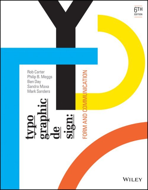
Figure 2.1: Typographic Design: Form and Communication by Rob Carter
Chapter 5: Syntax and Communication
Syntax is the connecting of typographic signs to form words and sentences on
the page.
The initial discussion of typographic syntax addresses the intrinsic
character of the individual letter.
Although the letter typically functions as part of a word, individual
letters are frequently combined into new configurations. As shown in Figures 2.2 combinations of letters A and g and P and Q are unified to create
a stable gestalt. In the illustrated examples, there is an expressiveness
and boldness to the individual letters. The syntax displayed here is an
example of letter combinations acting as signs, extracted from a larger
system of signs.
Figure 2.2: Individual Letters Combined Into Configurations
Chapter 6: The Typographic Message
This chapter introduces typography as a language of potent visible signs,
a language capable of educating, persuading, informing, and
entertaining.
Typography must communicate. This functional role is fulfilled when the
receiver of a typographic message clearly and accurately understands what
is in the mind of the transmitter. This objective, however is not always
accomplished. With a proliferation of typographic messages littering the
environment, most are missed or ignored. The messages that are noted,
possessing effective qualities relating to form and content, are
appropriate to the needs of both message transmitter and message receiver.
The impact of an affective typographic message cannot be easily measured.
Some may assume that since printed and broadcast messages are ephemeral,
they have little impact upon their audience. This assumption is false.
Because typographic ephemera are rhetorical they often have a long-range
effect upon a message receiver, influencing the context of social,
political, and economic events.


-15.jpg)
-05.jpg)
-06.jpg)
_Artboard%204.jpg)


.jpg)


.jpg)


Comments
Post a Comment