Interactive Design - Exercise 2

Shema Goldie Angwen / 0372129
Interactive Design
Bachelor of Design (Hons) in Creative Media / Taylor's University
Task: Exercise 2
CONTENT LIST
INSTRUCTIONS
Exercise 2 'Web Replication' Instructions:
Your task is to replicate TWO (2) existing main pages of the websites that you have analyzed in Exercise 1 to gain a better understanding of their structure. Follow the dimensions of the existing website, including the width and height. This exercise will help you develop your design skills using software such as Photoshop or Adobe Illustrator and gain insights into web design best practices.
You can use any image from a stock image or a free stock icon. The image that you will be using does not have to be an exact image from the original website. You may replace it with a similar image. Focus on the layout, type style, and color style. To find similar typefaces/fonts, you can download fonts from Google Fonts. You may need to screengrab the website and can begin to replicate the page.
Free image:
https://www.pexels.com/
Google Fonts link:
https://fonts.google.com/
LECTURE NOTES
WEEK 3: UNDERSTANDING WEBSITE STRUCTURE
Why Website Structure Matters
Website structure - the foundation of a user-friendly
and accessible website.
accessible: everyone including disability should be able to
access
Accessibility logo especially for those who has color
blind.
Figure 1.1: Accesibility Logo
The Three Key Elements
1. Header
- top section of a webpage
- contains the website's logo (on the left), navigation menu, and contact information
- provides quick access to essential information and navigation
2. Body
- the main content area of a webpage
- contains text, images, videos, and other multimedia elements
- proper organization is crucial for readability
- if you have plenty text, break the monotonous by adding images in between
3. Footer
- located at the bottom of a webpage
- includes copyright information, links to important pages, and contact details
- provides closure to the webpage and additional navigation options
Card Sorting
- a UX research method used to discover how people understand and categorize information
- is needed when the website is complex
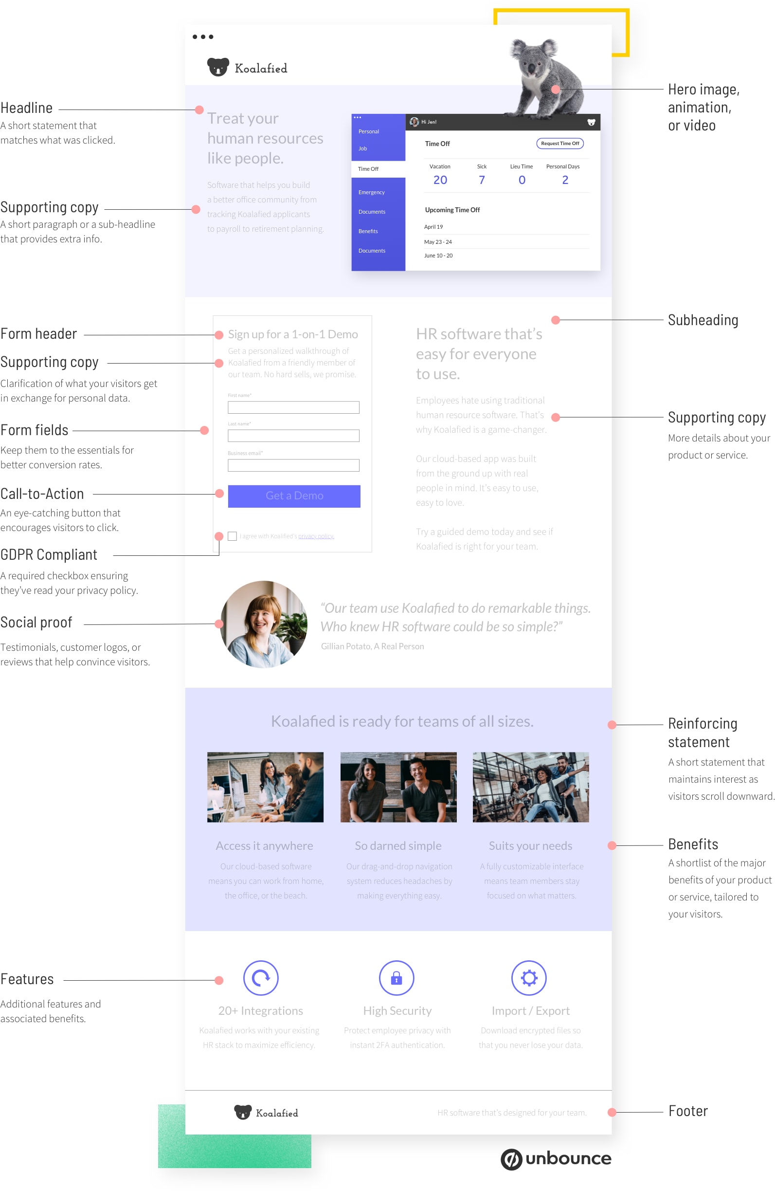
Website Given: Anatomy of Landing Page
EXERCISE 2
Web Replication
First Website: https://www.studioolimpo.it

Figure 2.1: Studio Olimpo Website Replication Process

Figure 2.2: Studio Olimpo Website Replication Process

Figure 2.3: Studio Olimpo Website Replication Process
First Step: Screen Capturing the Website Page
By right-clicking -> Inspect. Then, I moved the coding panel as far to the right as possible. Next, I made sure to turn off the 'Toggle Device Toolbar'. Then I click on 'Customize and control DevTools' -> 'Run Command' -> 'Capture Full Size Screenshot'.
Second Step: Setting Up the Artboard
We were instructed to use Adobe Illustrator for this exercise. After opening Illustrator, I set the artboard size to match the original layout of the Studio Olimpo Website by going to 'Object' -> 'Artboards' -> 'Fit to Artboard Bounds'.
Third Step: Import the Screenshot
In Illustrator, I went to 'File' -> 'Place' -> Choose the Image. After placing the image, I changed the 'Layer Options' by ticking the 'Template' box and set the 'Dim images' to 40%. This served as a guide to replicate the website layout
Fourth Step: Searching for Fonts
Next, I searched for the typeface that closely matched to the one that was used on the original website in Google Fonts.
Fifth Step: Adding Text, Elements and Images
I then added text, elements, and images, following the layout from the template starting from the header, body, footer.
Sixth Step: Adding Background Colour
After finishing adding the elements and images, I then choose the background colours using Eyedropper Tool to make it exactly the same with the original website. I completed this step at last to ensure that the background wouldn't block the template I used as a guide.
Seventh Step: Exporting the Final Outcome
After finishing the replication, I checked the design in details then exported it as PDF. I chose PDF format because the blog does not support uploading JPEGs, possibly because of the layout being too long.
THE FINAL OUTCOME
Figure 2.4: Studio Olimpo Website Replication Final Outcome, PDF
Second Website: https://munchies-tinloof.vercel.app

Figure 2.5: Munchies Website Replication Process

Figure 2.6: Munchies Website Replication Process

Figure 2.7: Munchies Website Replication Process
For the second website, the process is quite similar, but with an addition of Step #5.
First Step: Screen Capturing the Website Page
By right-clicking -> Inspect. Then, I moved the coding panel as far to the right as possible. Next, I made sure to turn off the 'Toggle Device Toolbar'. Then I click on 'Customize and control DevTools' -> 'Run Command' -> 'Capture Full Size Screenshot'.
Second Step: Setting Up the Artboard
We were instructed to use Adobe Illustrator for this exercise. After opening Illustrator, I set the artboard size to match the original layout of the Munchies Website by going to 'Object' -> 'Artboards' -> 'Fit to Artboard Bounds'.
Third Step: Import the Screenshot
In Illustrator, I went to 'File' -> 'Place' -> Choose the Image. After placing the image, I changed the 'Layer Options' by ticking the 'Template' box and set the 'Dim images' to 40%. This served as a guide to replicate the website layout
Fourth Step: Searching for Fonts
Next, I searched for the typeface that closely matched to the one that was used on the original website in Google Fonts.
Fifth Step: Adding and Editing Text
Since I couldn't find the typeface that matched exactly like the one they used for the logo, and the logo is a crucial element, so I decided to modify them manually by selecting the text then click 'Create Outline' and modified the text using the Pen Tool.
Sixth Step: Adding Elements and Images
I then added elements and images, following the layout from the template starting from the header, body, footer.
Seventh Step: Adding Background Colour
After finishing adding the elements and images, I then choose the background colours using Eyedropper Tool to make it exactly the same with the original website. I completed this step at last to ensure that the background wouldn't block the template I used as a guide.
Eighth Step: Exporting the Final Outcome
After finishing the replication, I checked the design in details then exported it as PDF. I chose PDF format because the blog does not support uploading JPEGs, possibly because of the layout being too long.
THE FINAL OUTCOME
Figure 2.8: Munchies Website Replication Final Outcome, PDF
REFLECTION
This exercise taught me a lot. I learned how to properly place elements and how important it is to maintain consistency in fonts, colors, and layout. I also learned to view a website from the user's perspective and how to create a user-friendly design. I now understand what makes a website enjoyable to use and what doesn’t. Implementing usability principles is truly important, and I must say, I really enjoyed this module.


Comments
Post a Comment